UPDATE (20/12/2024): It took us a bit, but Steam has made updates to what graphical assets they need. They’ve also helpfully made templates for each asset, though these are all separate files. We’ve updated our template that uses smart objects accordingly!
The first impression your Steam Page makes is critical for getting those wishlists or purchases. Thus, it makes sense to spend quite a bit of time making your graphical assets great!
We were revamping our old games’ Steam Pages, and found that resources on Steam’s graphical assets were usually confusing or buried under too much text. Though the Steam Guidelines outline everything, the doc might be a slog to get through! (It is still vital that you check through things, though.) So, we decided to make this helpful guide to complement Steam’s documentation, with visual infographics, list of image sizes, and broad tips on preparing your game’s graphical assets for your Steam Page.
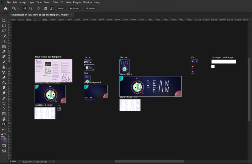
Plus, we’ve made a free .PSD template for Steam Store Page assets, with linked Smart Objects and artboards all in one file so you can populate your assets across the different sizes and formats!
Below are a helpful summarised list of all the required image assets, their dimensions, and where they’re located! Or jump to the section you’d like below:
Steam Store Page
Accepted formats: PNG, JPG
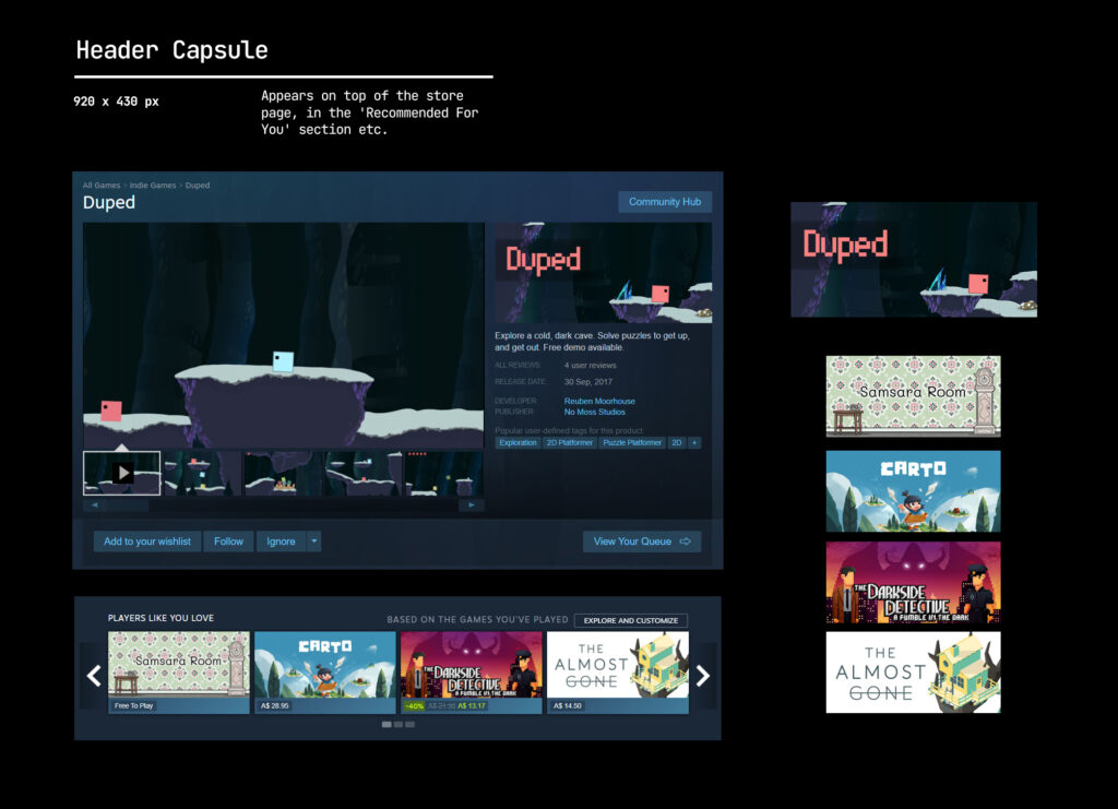
Header capsule image: 920x 430 px
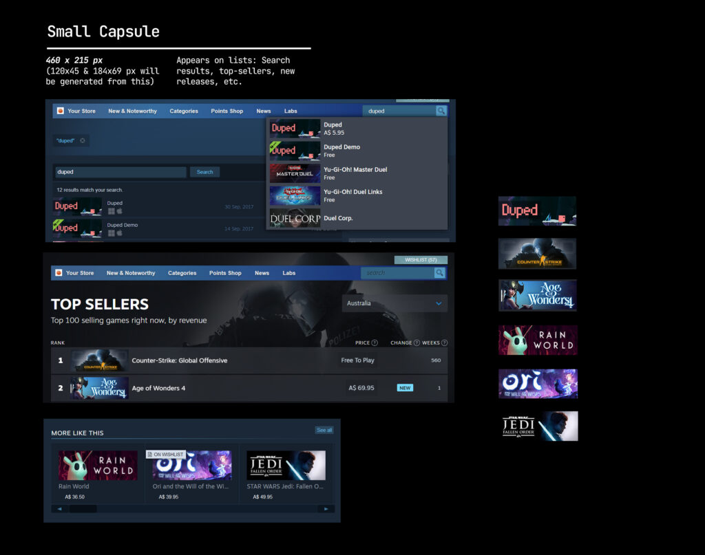
Small capsule image: 462x 174px
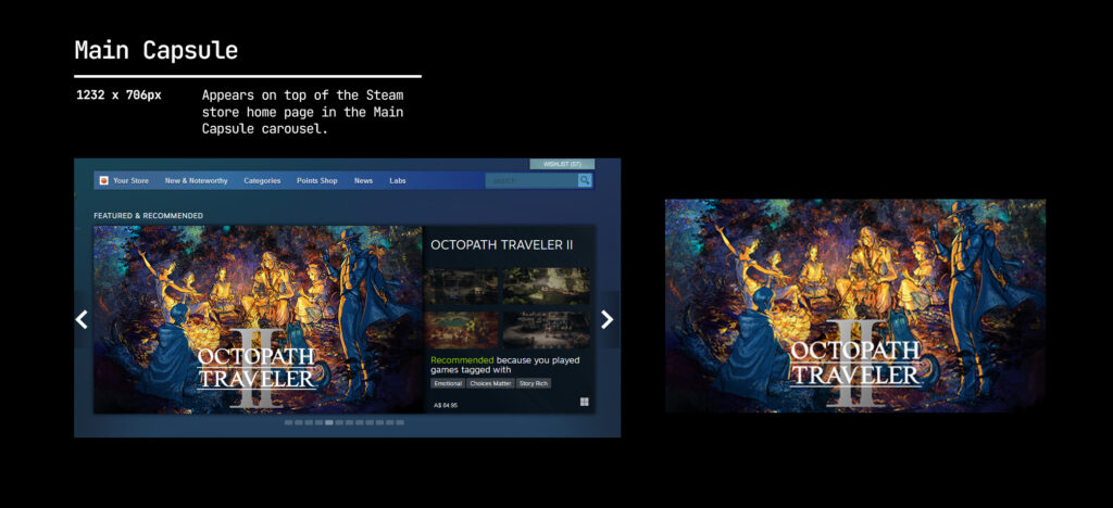
Main capsule image: 1232x 706px
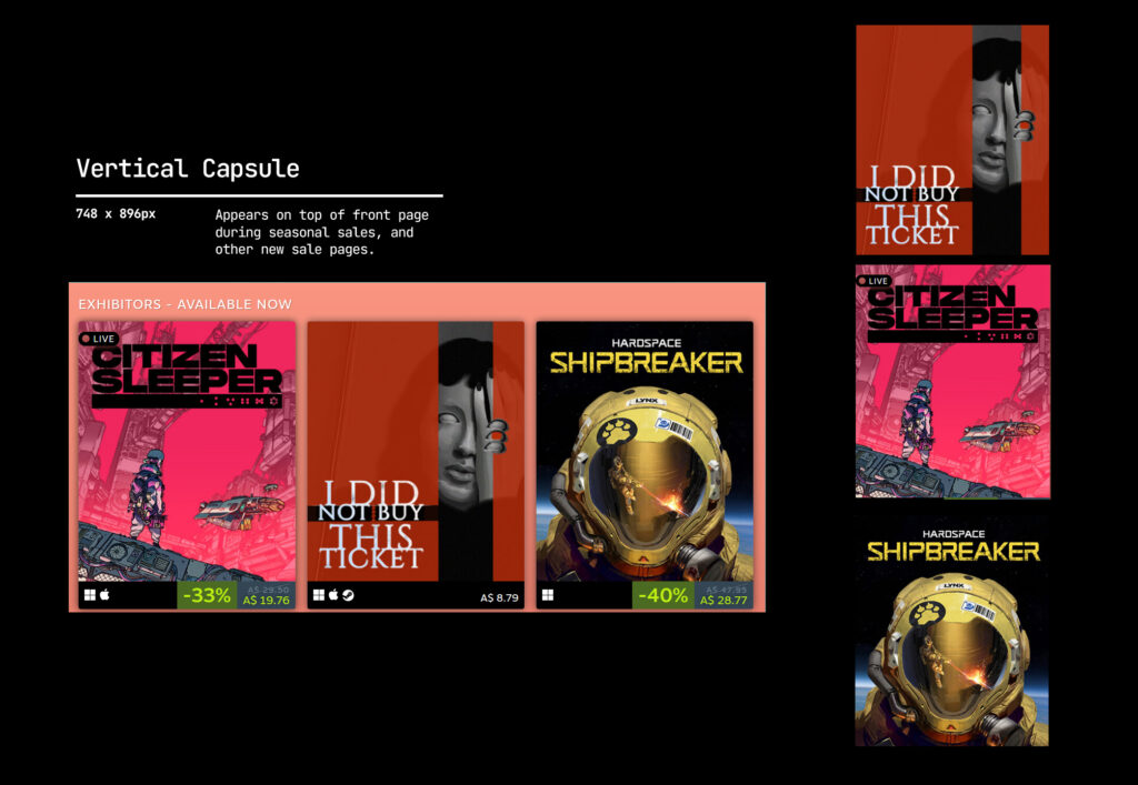
Vertical Capsule: 748px x 896px
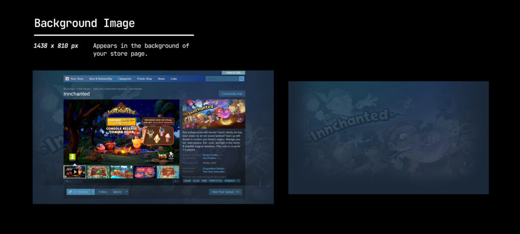
Page background (optional): 1438 x 810 px
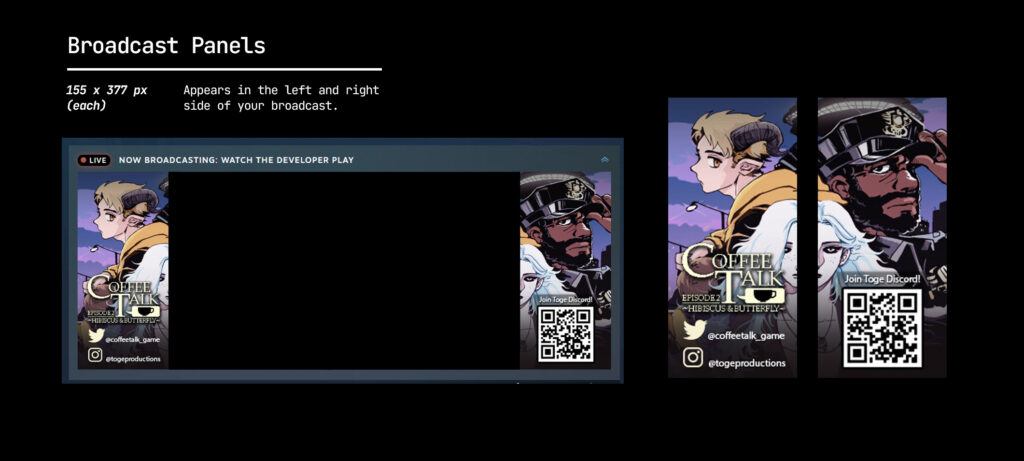
Steam broadcast: 155 x 337 px
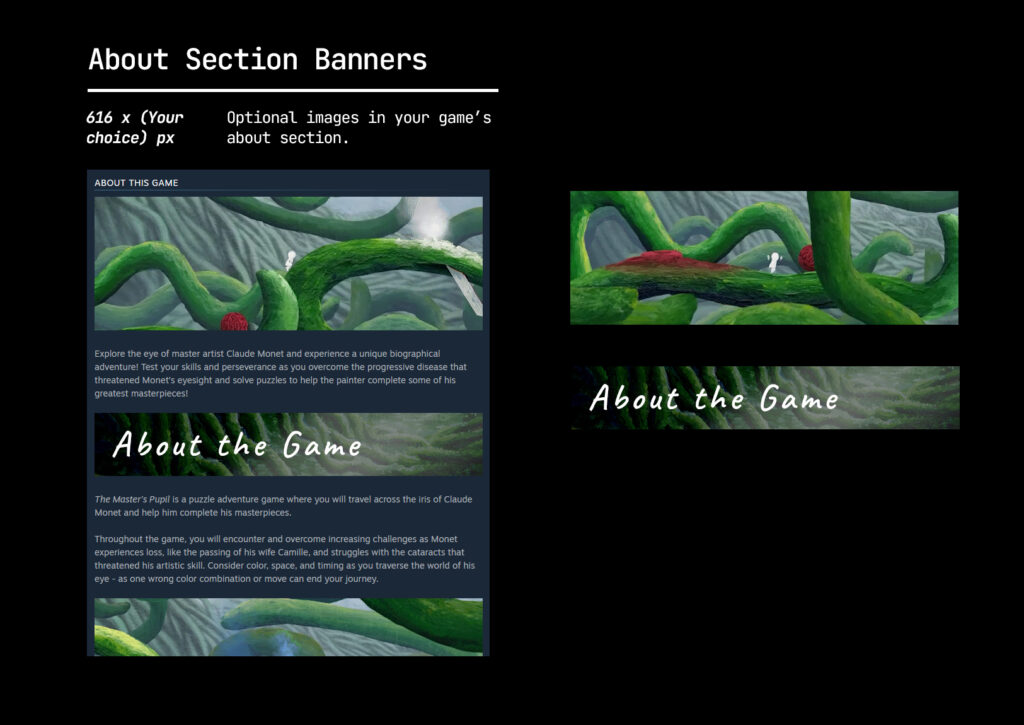
About Section Banners: 616 x (your choice) px
(Animated GIFs permitted, but check the Optimise your Images section for more tips and things to consider.
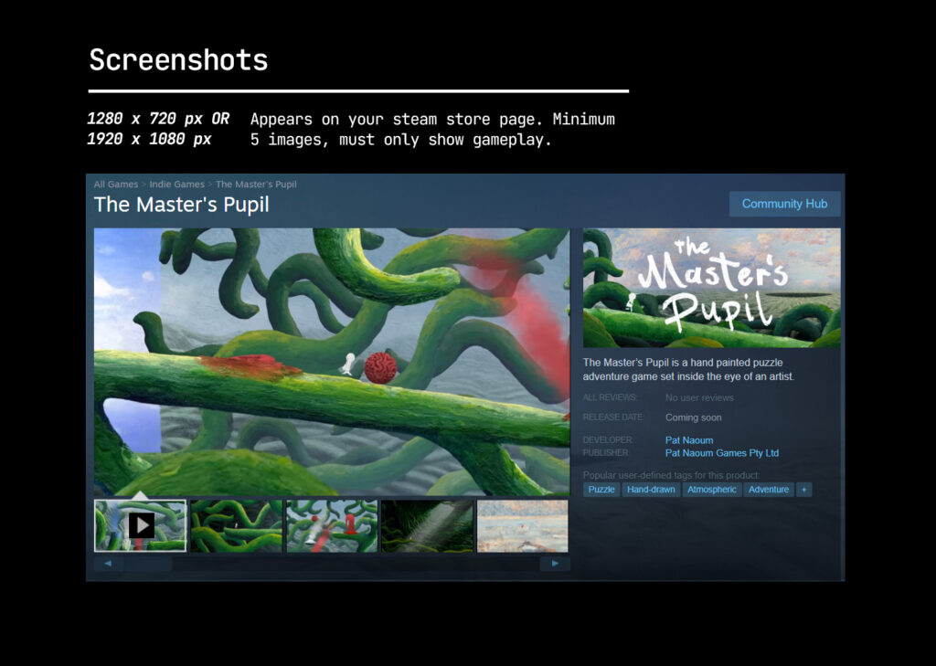
Screenshots (minimum 5): 1280 x 720 px OR 1920 x 1080 px
Steam Library
Accepted formats: PNG, JPG
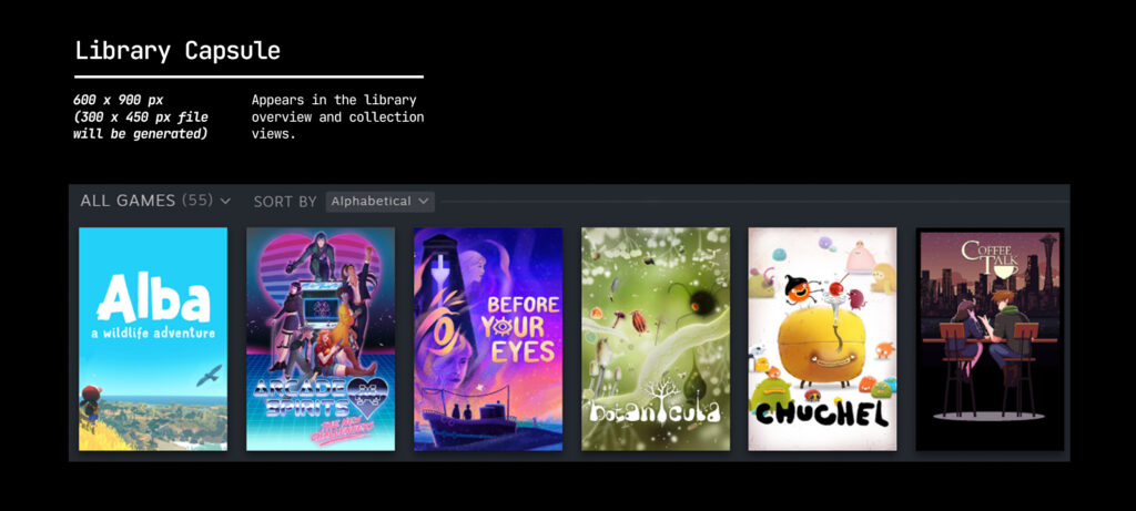
Library Capsule: 600px x 900px
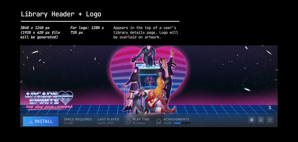
Library Hero: 3840px x 1240px
Library Logo: 1280px x 720 px
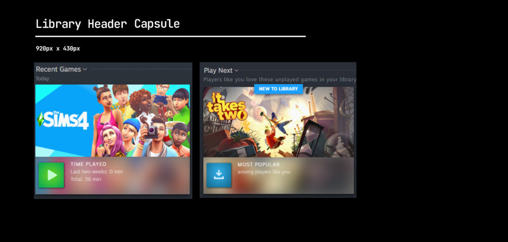
Library Header Capsule: 920px x 430px
Steam Community Hub
Accepted formats: PNG, JPG
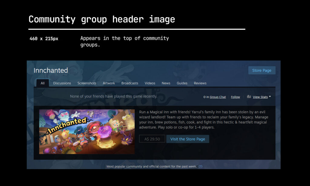
Community group header image: 460 x 215px
Community Icons: 184 x 184 px
Client icons: 32 x 32 px
Steam Developer Pages
Accepted formats: PNG, JPG
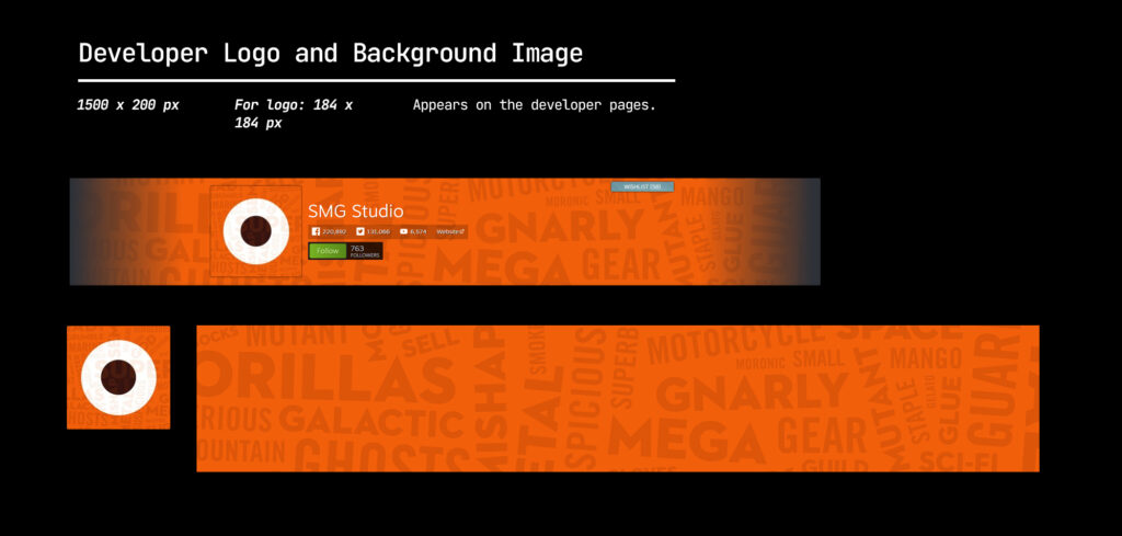
Developer logo: 184 x 184 px
Background image: 1500 x 220 px (Can be an animated GIF too)
General tips for making great graphical assets on Steam
Omit CTA text
This is actually a part of the Steam Guidelines. Do not add “add to your wishlist” and other extraneous text onto any of your graphical assets. This also includes awards, sales/discounts, review scores etc.! The only time these are allowed is when you are creating Capsule Artwork Overrides, but this is still limited to game content updates only. (Eg. new localisation patches, DLCs etc.)
Link your assets to make global editing possible
If you’re using Adobe Photoshop, create your assets with linked smart objects on Photoshop and the various artboards for all the different assets. This way, you can change just the one working file and update it across your artboards. For example, if you’d like to swap out a logotype version for another, or a featured character. This is also possible on Adobe Illustrator, plus you can use the recolour artwork tool to make global changes to colours used throughout your project.
We’ve made a Photoshop template for the Steam Store assets you can find here. Instructions within!
Prioritise logo readability
As you can see from the examples above, your logo might be the only visible image in some of your store capsules. Competing with so many other titles in lists, it becomes critical for your logo to balance both readability and information about your game’s tone/theme.
It also pays to pay attention to the composition of your assets! Check out this tutorial on composition or reference movie posters/editorial assets/illustrated posters to figure out what works for your game.
Optimise image sizes
All images on your Steam Store page will require some time to load and might cause higher bounce rates (People leaving your page).Thus, it makes sense to reduce your file sizes as much as possible without compensating quality. Check out this article on image file reduction best practices on the web, which can be applied to images you use on Steam Store pages! In particular, be aware of optional assets such as gifs and images that go onto your about section. If your image doesn’t do much (AKA inform critical selling points), remove it!
Tips and tricks in the Steam About Section
We’ve done a bit of research and compiled a short list of design strategies and tricks other gamedevs have used in their Steam Page’s about section. There aren’t any set rules for designing assets in this section of your Steam page, but we thought it might be helpful to share some tips! See the full rules for the about section here.
Set your GIF files’ first frame to the “action” shot
If you are making animated banners, make the first few frames the “action shot” on the get go. GIFs take time to load, so deferring any other animation to later frames will help getting key information to viewers immediately. Of course, if you’re showing clips of gameplay, this might not apply!
Design according to your audience
Depending on who your players are, your design choices in the About section might change. For example, for games with better graphics or unique gameplay mechanics to show, GIFs might be relevant to use. It is also a reasonable assumption that these players would have better machines/tech, and that larger sized GIFs might not be too bad for load times. If your players use machines (and likely WIFI) that aren’t as powerful, GIFs would have a bigger influence on page loading times. Design your assets according to who is playing your game and what you’d like them to learn from you!
Use images for text content
Some devs use images for heading and linebreaks within the about page. This helps with making the text more digestible to readers, thought take care to use readable fonts! Note, when designing these, do not mimic Steam store UI or buttons.
We hope this guide has helped! Have a question or want to chat more about game development? Reach out to us!
Other places you can find us:
- Join our Discord server
- Sign up to our newsletter